LGBTQI+. Persecuted.

Glenn Walls. Fierce bitch seeks future ex-husband – David McDiarmid – Lost. Perspex on board. 29 x 42 cms (Book cover). 2019. From David McDiarmid, Rainbow Aphorisms digital print series, 1994.

Glenn Walls. The most common way people give up their power is by thinking they don’t have any – Alice Walker. Perspex on board. 29 x 42 cms (book cover). 2020.

Glenn Walls. For most of history, anonymous was a woman. Virginia Woolf. Cut short. Perspex on board. 29 x 42 cms. (Book cover). 2019.
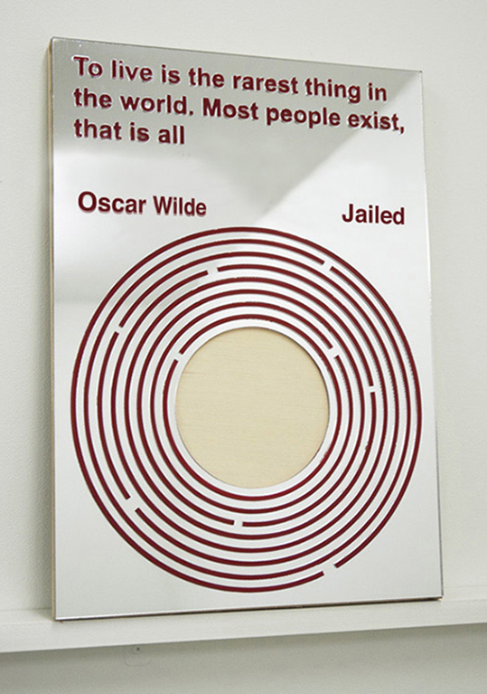
Glenn Walls. To live is the rarest thing in the world. Most people exist, that is all. Oscar Wilde. Jailed. Perspex on board. 29 x 42 cms (Book cover). 2019.

Glenn Walls. If a bullet should enter my brain, let that bullet destroy every closet door. Harvey Milk. Murdered. Perspex on board. 29 x 42 cms. (Book cover). 2019.
Glenn Walls. LGBTQI+. Persecuted. 9 x Perspex on board. 29 x 42 cms. (Book cover). 2019 – 2020.
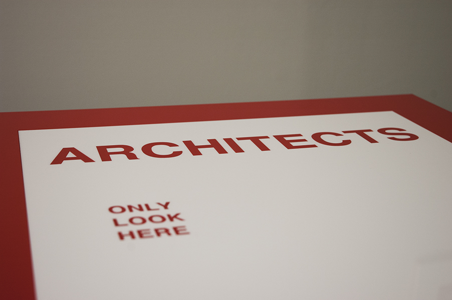
Reworking of book covers from my 2012 exhibition “Life Without Objects” held at TCB.
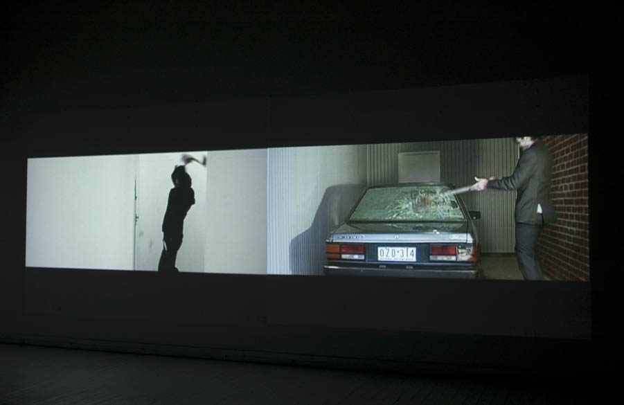
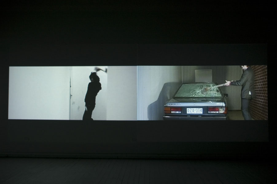
Death by Apple

Glenn Walls. Death by Apple. iMac, axe handle, mirror perspex. 2019

Glenn Walls. Death by Apple. iMac, axe handle, mirror perspex. 2019
MASSACRE – BODIES THAT MATTER
KINGS ARI, MELBOURNE
1 December – 20 December 2018
Website: http://www.kingsartistrun.org.au/program/massacre/
In November 2018 I held an exhibition at KINGS ARI on the gay/hate murders that took place in Sydney during the 1970s, 80s, 90s and early 2000 called Massacre.
Link to the exhibition: http://www.kingsartistrun.org.au/program/massacre/

Glenn Walls. Massacre (after Felix). Digital Print on paper stack, 2018. List of the 88 gay/hate murders that took place during the 1970s, 80s, 90s and early 2000s.

Glenn Walls. Massacre (after Felix). Digital Print on paper stack, 2018

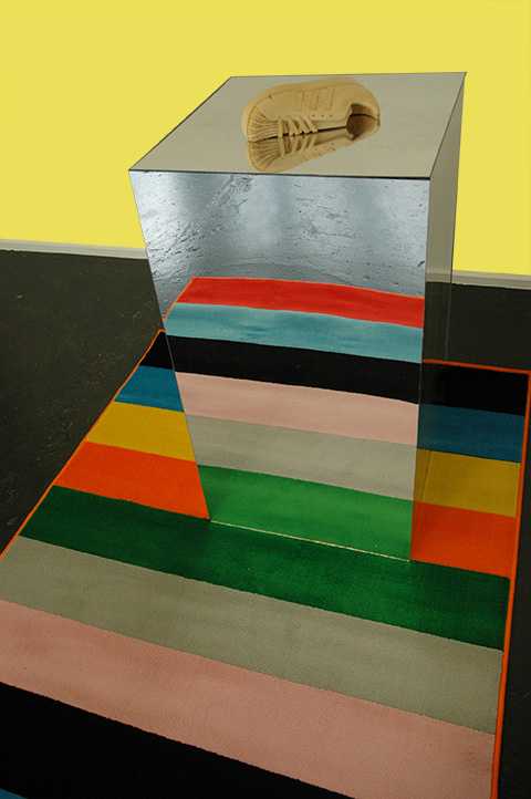
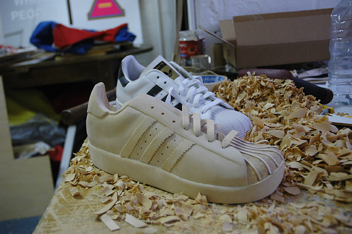
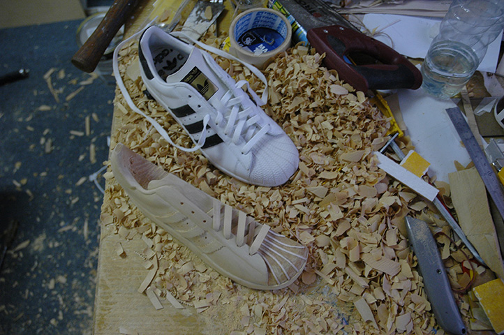
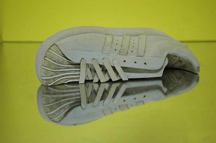
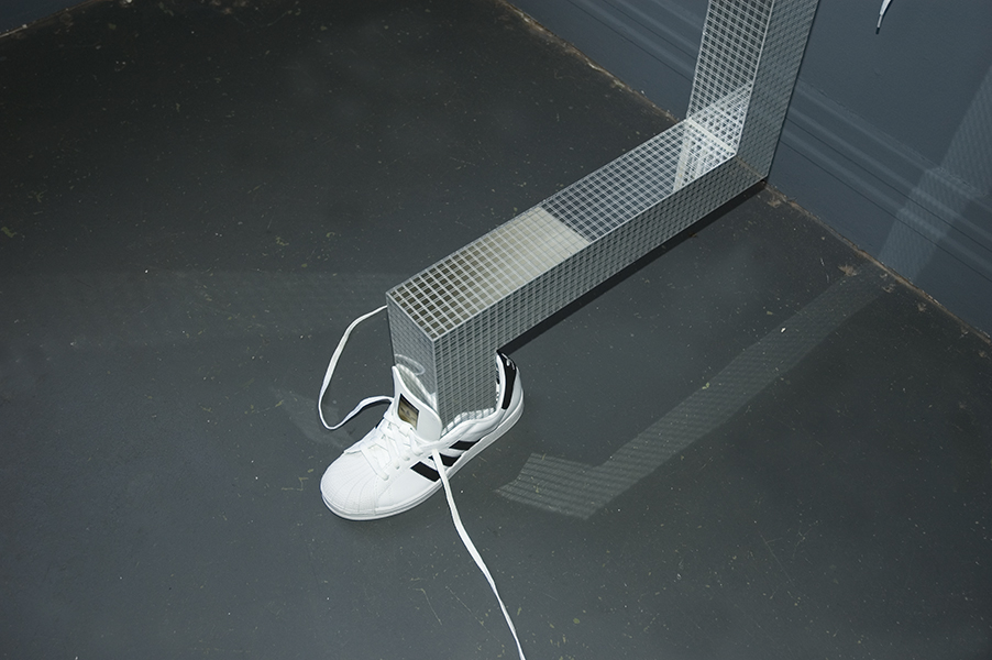
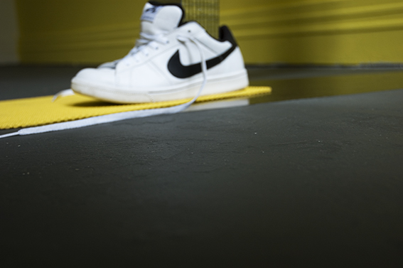
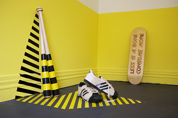
Glenn Walls. Lost Sole (Nike sneaker). Jelutong wood (Hand carved), pencil on paper, Mirror plinth. 2018

Glenn Walls. Lost Sole (Nike sneaker). Jelutong wood (Hand carved), pencil on paper, Mirror plinth. 2018
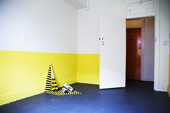
Glenn Walls. Massacre (Disco Glare). Baseball bat, mirror tiles. 2018.
Glenn Walls. Massacre (after Felix). Digital Print on 4 x A3 paper stacks. 2018.

Glenn Walls. Massacre (Disco Glare). Baseball bat, mirror tiles. 2018.

Glenn Walls. Massacre (Disco Glare). Baseball bat, mirror tiles. 2018.
Glenn Walls. Image above & below. Massacre (after Felix). Digital Print on 4 x A3 paper stacks. 2018.


Glenn Walls. Massacre (after Felix). Digital Print on paper stack, 2018

Glenn Walls. Massacre (Disco Glare). Baseball bat, mirror tiles. 2018.


Massacre – Opening 30th November 2018
Kings ARI. 171 King St, Melbourne. Exhibition Dates: 1st December – 21st December 2018
For further details Kings ARI
http://www.kingsartist.run.org.au/program/massacre/
Massacre – Bodies that Matter
‘Our blood runs in the streets and in the parks and in casualty and in the morgue…. ‘Our own blood, the blood of our brothers and sisters, has been spilt too often….
‘Our blood runs because in this country our political, educational, legal and religious systems actively encourage violence against us…
‘We are gay men and lesbians.’
From the ‘One in Seven’ Manifesto, Sydney Star Observer, 5 April 1991
During the 1970s, 80s & 90s in Sydney, Australia a high number of LGBTIQ people were violently bashed, murdered or disappeared entirely. Although some of these incidents were reported in the gay press and the NSW Anti-Discrimination Board[1] at the time many remained unreported to the authorities[2] due to cultural and societal attitudes with and within the NSW police force and the wider community tolerance of homosexuality. With the advent of AIDS in the 80s, “a significant media and social response of gay alienation within the context of ‘moral panic’ occurred” (Strike Force Parrabell 2018, p. 13). ‘Beats’ such as toilet blocks, public parks and beaches (Bondi Headlands) where men met other men for sex or social contact became the target of gangs that felt it was their duty to rid and protect the community of such ‘intolerable’ behaviour [3].
By the late 90s, early 2000s with a growing acceptance within the wider community of homosexuality a series of media reports and research papers emerged within the mainstream press highlighting both the injustice caused to the LGBTIQ community and the entrenched homophobia and failure within the NSW police force that allowed a ‘killing and bashing spree” to take place with little repercussion to the perpetrators[4].
American PhD candidate Scott Johnston was only 27 when he died. “It was December 10, 1988, when Scott’s naked body was found by two rock fishermen at the base of the cliff, near Blue Fish Point, just south of Manly, on Sydney’s northern beaches. Scott’s clothes had been found neatly folded on the clifftop above” (Kontominas 2017) including his pair of Adidas sneakers. This is shown in the exhibition as a wood carving. The police deemed it a suicide. Three months later, Coroner Derrick Hand came to the same conclusion. His brother Steve Johnson and boyfriend of five years, Michael Noone is still today not convinced that this is the case. All failed to acknowledge that the location was a well know beat where anti-gay gangs operated and where other gay/hate murders had occurred previously.
The main research question addressed in this exhibition is:
Through sculptures, architectural models and digital prints, in what ways can I reconfigure the masculine/heterosexual dominance of Superstudio’s anti-design grid to a personal interpretation of queer space?
My reading and understanding of this grid argues a social, philosophical and identity position in which to interpret my works, giving the audience a greater understanding in the power of things to form a narrative for the object or space. My aim is to think through these processes via practice, critiquing Superstudio’s anti-design grid to produce work that re-evaluates masculine/heterosexual dominance of architectural space by highlighting an injustice done to a minority.
Research contribution
Architecture’s preoccupation with ‘normality’ has left little room for queer domestic space to come to the fore. I argue that ‘the “normality” of heterosexuality is so deeply ingrained in Western culture that it is not even seen’ (Myslik 1996, p. 159). So entrenched is this understanding that I have found little evidence of the public acknowledgement of queer space in the built environment, let alone one highlighting queer injustices. Few artists have broached this subject. I am interested in creating a personal definition of queer space that was not hidden and is a reaction against normative symbols of masculinity and the ‘heterosexual assumption’ presented by Superstudio anti-design grid.
Inspired by Cuban artist Felix Gonzalez-Torres work “Untitled” (Death by Gun), 1990, this exhibition will be based on research conducted on the gay killings that took place in Sydney in the late 1970s till 2000. This was a period of extreme distrust by the LGBTQI community in the NSW Police Force who symmetrically failed to acknowledge, protect, report or simply dismissed community concerns. This will result in a series of works highlighting the high number of victims and the fact that a number of murders are unsolved. Although there is conjecture as to whether some of these murders are a gay/hate crime, the fact that were not properly investigated at the time is a dark stain on our history.
What is Strike Force Parrabell?
On 30 August 2015 Strike Force Parrabell commenced a thorough investigative review to determine whether 88 deaths originally listed in a submission to the Australian Institute of Criminology[5], and commonly referred to by media representatives, could be classified as motivated by bias including gay-hate (Strike Force Parrabell 2018).
NOTES
[1] While the onset of HIV/AIDS has been seen as a motivating factor for some of the violence, the start of the violence predates that. A report by the NSW Anti-Discrimination Board in 1982 already highlighted the issue, and over that decade, there was ongoing and increasing violence. In 1990 the Surry Hills police noted a 34% increase in reports of street bashings during that year alone (Wotherspoon 2017).
[2] The Gay and Lesbian Rights Lobby and later, the AIDS Council of NSW (now ACON) kept records, usually comprising self-reported incidents of gay-hate violence, that on several occasions amounted to more than 20 entries per day. Unfortunately, fear associated with anti-gay attitudes of officers within the NSW Police Force at the time prevented these reports being formally recorded, which in turn meant that crimes were not investigated (Strike Force Parrabell 2018, p. 14 & 15)
[3] This inherent lack of consequences or accountability meant that perpetrators were given a kind of ‘social license’ to continue inflicting violence upon members of the gay community. This phenomenon has been associated with what some perpetrators believed was their moral obligation, driven by poor societal expectations. The Bondi incidents together with similar disappearances and deaths of men in and around beats attracted heightened levels of violence and were often associated with a victim’s sexuality or perceived sexuality (Strike Force Parrabell).
[4] During the 1970s, there were ongoing demonstrations in Sydney focusing on what needed to be changed to give homosexuals equal civil rights with their heterosexual counterparts. One of the catchcries of the time was ‘stop police attacks, on gays, women and blacks’. And this catchcry highlights an important fact: that the police were seen as the enemy by many of these emerging social movements. As for gays, the police had never been sympathetic to their parading through Sydney’s streets. And this antipathy culminated in the notorious first Mardi Gras, on the night of Saturday 24 June 1978; it started out as a peaceful march down Oxford Street from Taylor’s Square to Hyde Park, and ended in Kings Cross with police wading into the marchers with their batons, leading to 53 arrests (Wotherspoon 2017).
[5] In 2002, a list of 88 deaths of gay men between 1976 and 2000, potentially motivated by gay hate bias were compiled by Sue Thompson, the then NSW Police Gay and Lesbian consultant. There has been significant media coverage of presumed facts associated with gay hate motivation for each of these 88 deaths.
Reference List
In the Pursuit of Justice. Documenting Gay and Transgender Prejudice Killing in NSW in the Late 20th Century 2017, ACON. viewed 11th November 2018, https://www.acon.org.au/wp-content/uploads/2018/05/In-Pursuit-of-Truth-and-Justice-Report-FINAL-220518.pdf.
Kontominas, B 2017, Scott Johnson: Inside one brother’s 30-year fight to find the truth, ABC News, viewed 11 November 2018, https://www.abc.net.au/news/2017-11-30/scott-johnson-inside-brothers-fight-to-find-the-truth/9211466
Strike Force Parrabell 2018, New South Wales Police Force. viewed November 11 2018, https://www.police.nsw.gov.au/safety_and_prevention/your_community/working_with_lgbtqia/lgbtqia_accordian/strike_force_parrabell
Wotherspoon, G 2017, Gay Hate Crimes in New South Wales from the 1970s, viewed 11th November 2018, https://www.acon.org.au/wp-content/uploads/2018/05/In-Pursuit-of-Truth-and-Justice-Report-FINAL-220518.pdf.
Philip Johnson
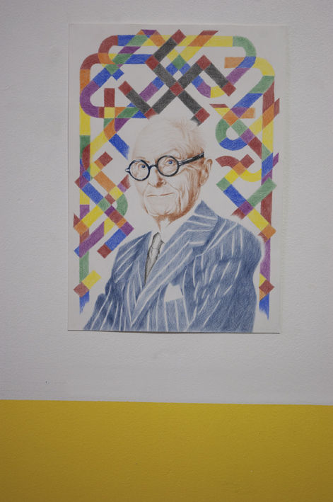
Glenn Walls. Philip Johnson. Pencil on Paper. 2018
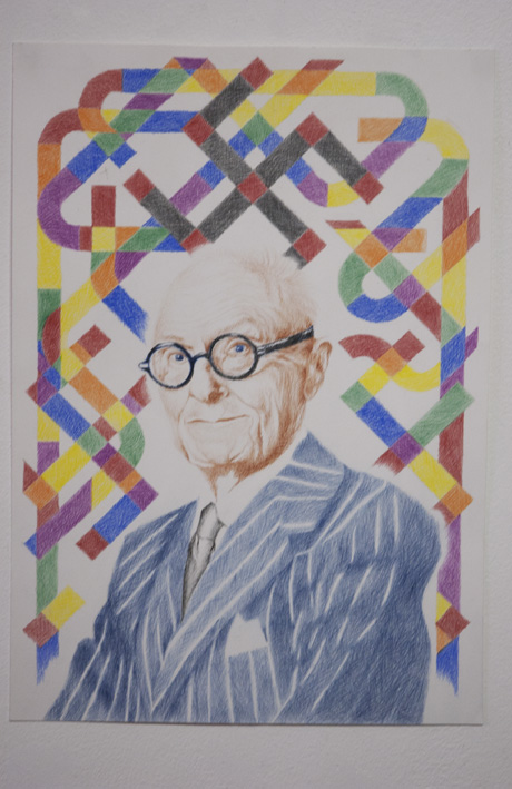
Glenn Walls. Philip Johnson. Pencil on Paper. 2018
National Pride
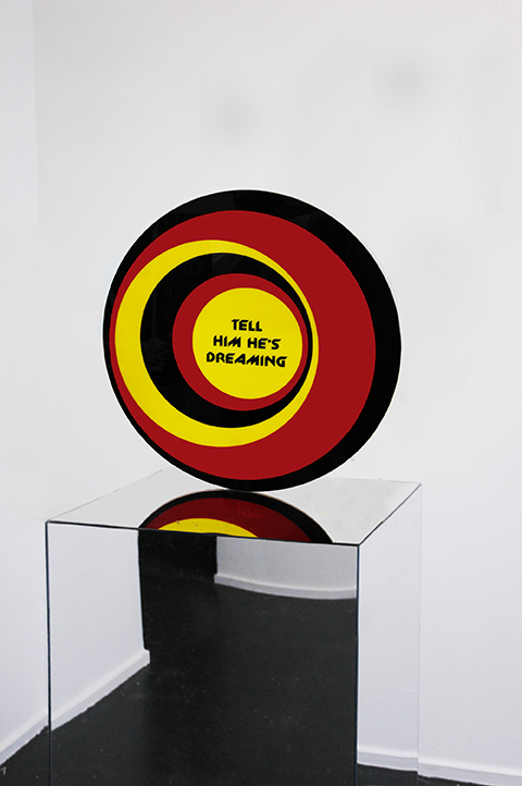
Glenn Walls. National Pride – Indigenous Flag. Acrylic Perspex. 59 cms diameter, 2017.
“Tell him he’s dreaming” is taken from the 1997 Australian movie, “The Castle”.
Why Bother
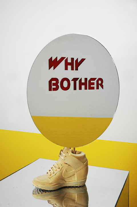
Why Bother. (Woman’s Nike Sky Dunk Hi Essential). Jelutong wood, mirror perspex, yellow paint. 2017
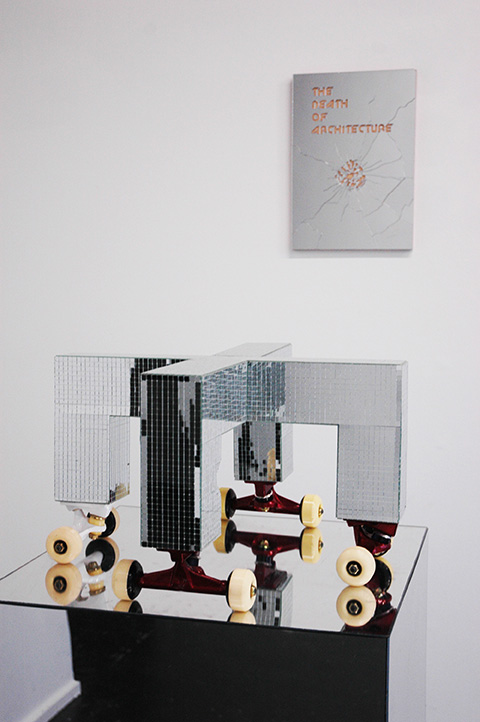
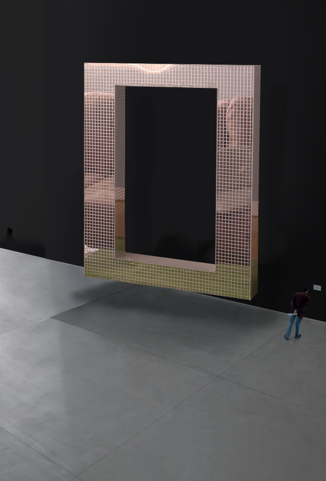
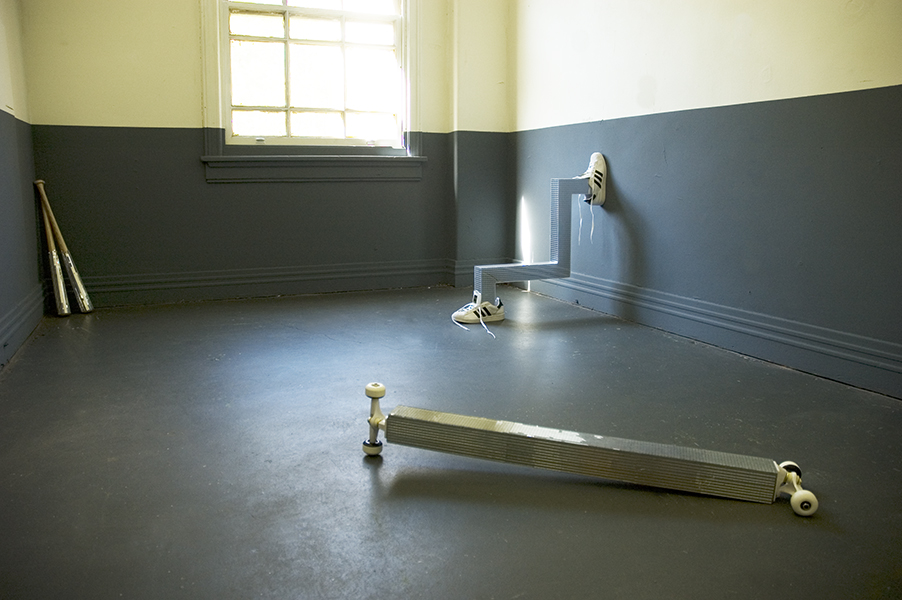
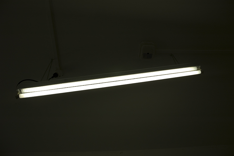
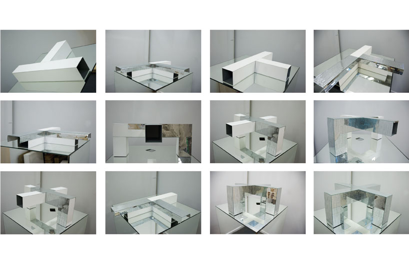
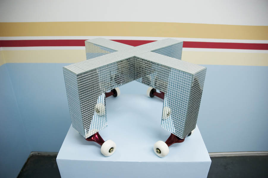
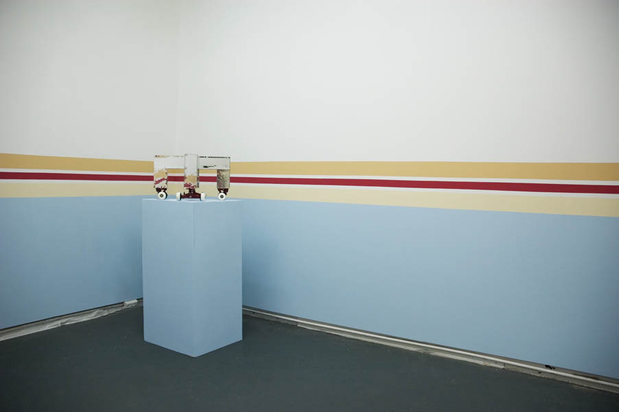
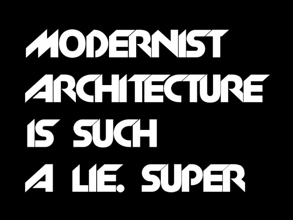
The Death of Architecture (Superstudio: The Continuous Monument)
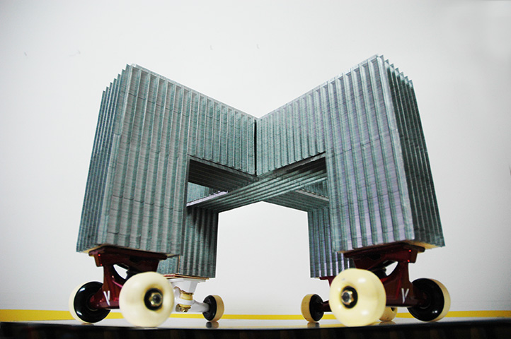 Glenn Walls. The Death of Architecture (Inspired by Superstudio, The Continuous Monument). Metal staples & Skateboard wheels. 2016
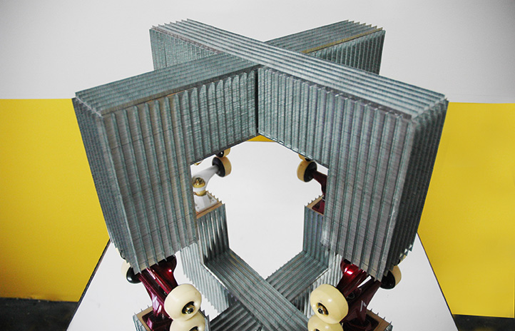 Glenn Walls. The Death of Architecture (Inspired by Superstudio, The Continuous Monument). Metal staples & Skateboard wheels. 2016
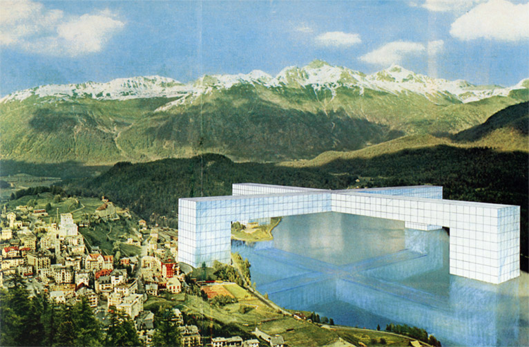 Superstudio, The Continuous Monument. Never constructed 1969 – 71
On top of the world… Il Monumento Continuo, a gridded structure that the Superstudio architects suggested would eventually cover the planet (Glancey, J. 2003).
The Death of Architecture (Part 4)
The Death of Architecture (Part 4) . Based on Superstudio, The Continuous Monument. Mirrors, mirrored perspex on wood, skater wheels
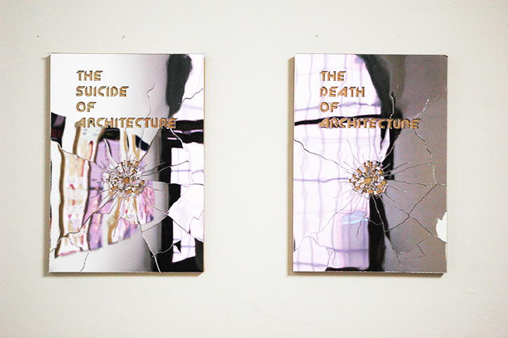
The Death of Architecture (Part 4) Mirrored perspex on wood.
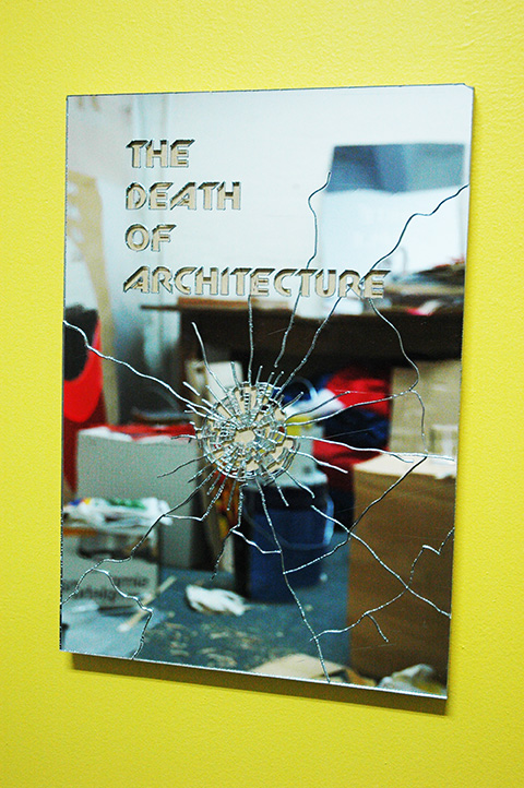
The Death of Architecture (Part 4) Mirrored perspex on wood.
The Death of Architecture (Part 3)
The Death of Architecture (Part 3). Mirror perspex, Jelutong and wool rug
The Death of Architecture (Part 3). Development work. Jelutong
The Death of Architecture (Part 3). Development work. Jelutong
The Death of Architecture (Part 3). Development work. Jelutong
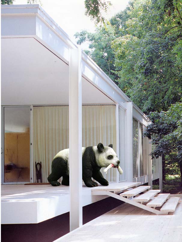
Death of Architecture: Farnsworth House (Part 2)

Death of Architecture: Ludwig Mies van der Rohe, Farnsworth House (Part 2)
The Death of Architecture. Superstudio (Part 1)
Super Suspended 2. Mirrored tiles, skate wheels, various materials. 2016
Based on the Continuous Monument by Superstudio. Background taken from Cite de I’Architecture et du Patrimoine.
I am Australian 2015

I am Australian. Acrylic on wood . 29 x 42 cms each panel. 2015
Domestic Scale

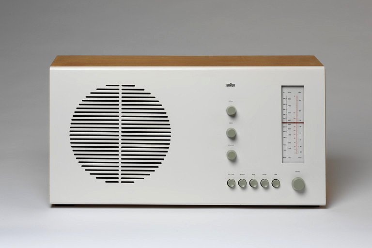
German designer Dieter Rams (1932 – ) epitomised the modernist aesthetic within his designs that adhered to principle of ‘form follows function’.
As head of design at Braun, the German consumer electronics manufacturer, Rams emerged as one of the most influential industrial designers of the late 20th century by defining an elegant, legible, yet rigorous visual language for its products (Design Museum, 2014).
Rams’ objective was to design useful products, which would be easy to operate (Design Museum, 2014). Rams embraced the modernist aesthetic of ‘less is more’ Rams’ designs always looked effortless with an exquisite simplicity borne from rigorous tests and experiments with new materials and an obsessive attention to detail to ensure that each piece appeared flawlessly coherent. Dieter Rams remains an enduring inspiration for younger designers, notably Jonathan Ive and Jasper Morrison, who have acknowledged his influence in their work at Apple and Rowenta respectively (Design Museum, 2014).
My work focuses on the use of Rams radio design series for Braun, including RT20 table radio, 1961, as a framework to construct narratives that modify the designer original intentions by creating variant surfaces on the object. I am interested in how I can construct narratives by adding new layers to these objects in order to imbue them with personal significance. Through the placement of text and pattern that interrupts the modernist aesthetic, I envisage how we are able to occupy and personalise these objects to our own agenda.
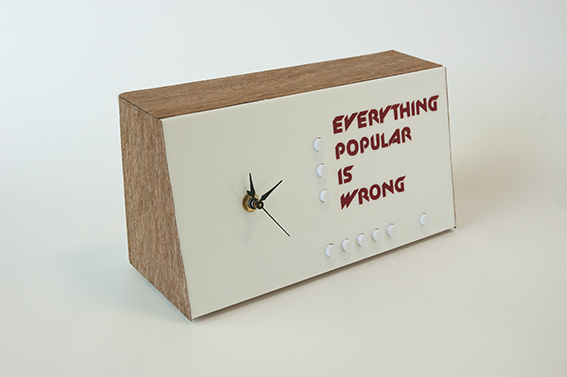
Everything popular is wrong (Oscar Wilde) Wood, Perspex, working clock, 2013
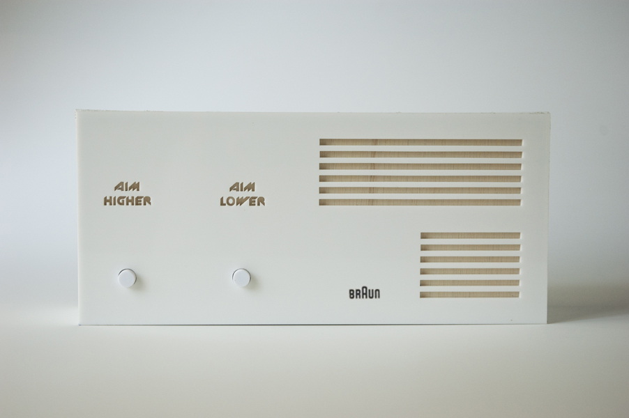
Aim Higher / Aim Lower. Wood, Perspex, 2013, 130 x 250 x 95 mm

There is a possibility something will fuck up today. Wood, Perspex, working clock, 2013


Glenn Walls’ series of sculptures could be mistaken at first glance, for everyday domestic appliances. Based on the RT20 radio designed by Dieter Rams in 1961, Walls interrogates the tenets of Modernism by transforming the radio into a functioning clock and applying disruptive text that subverts the minimalist simplicity of the design. In works such as There is a Possibility Something Will Fuck Up Today, 2013, this modification serves to unpick Modernism’s master narratives – such as the notion of creating a definitive design prototype appropriate for every person and context as seen in the International Style of Le Corbusier. Fittingly, this series is juxtaposed next to iconic furniture such as Grand Confort, 1928-30, by Le Corbusier, Jeanneret and Perriand, plus Marcel Breuer’s Wassily chair, 1925-26, that forms part of the exhibition design schema. Through visual and conceptual interference, Walls is able to personalise the aesthetic principles of Modernism, harnessing their attributes to serve his own agenda.


Large scale bookcovers

Glenn Walls. Self and Boring Others, Perspex on wood. 2014

Glenn Walls. No Difference at all. Perspex on wood. 2014.
No Difference At All is based on R. D. Laing 1961 book, Self and Others (seen in the top work). Eminent Italian graphic designer Germano Facetti designed the cover. R.D. Laing was a Scottish psychiatrist who wrote extensively on mental illness. The World Health Organisation considered homosexuality a mental illness until 1993. Using Facetti design of Laing’s book cover, No Difference At All highlights that sexual preference within the LGBTI community is no longer considered a mental illness by most western countries, however countries such as Uganda recently have imposed harsh anti gay laws and continue to label it as a mental disorder. The three circles are the colour of the Uganda flag. The red circle of the work is a mirror where we see a reflection of ourselves, noting that there is no difference at all, legally or medically between any of us. We are all the same no matter what our sexual preference may be.
Humanising
Glenn Walls. Humanising Le Corbusier. Plan Voisin for Paris. 2014


Le Corbusier (Charles-Édouard Jeanneret). Plan Voisin for Paris. 1925.


Glenn Walls. Humanising Le Corbusier. Plan Voisin for Paris. 2014

The Plan Voisin is a solution for the center of Paris, drawn between 1922 and 1925 by Le Corbusier.
The plan for 1925 seems to be a direct transposition of the diagram of Contemporary City for three million
drawn in 1922. Included are buildings available in a regular orthogonal grid occupying a very important part
of the right bank of the Seine. The space is highly structured with two new traffic arteries pierced through
the city, one on the east-west, the other on a north-south. Their role is not limited to the organization of
Paris, as were the advances of Haussmann: they pass through the fortifications and the suburban area. They
have the ambition to link the capital to the four corners of the country, the major French and European cities.
The crossroads at the intersection of these two avenues is the center of the plan, the center of the city
in central France. (http://densityatlas.org/casestudies/profile.php?id=99)
How to avoid everything
How to avoid everything booklet
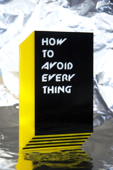
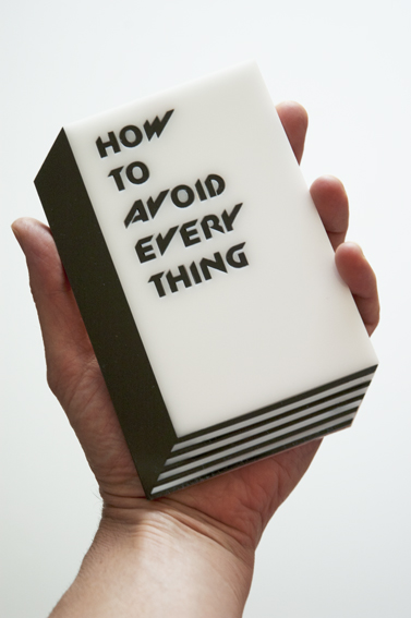
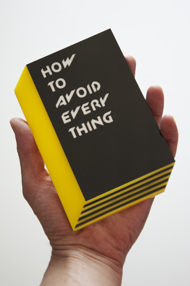
Glenn Walls, How to avoid everything, Yellow booklet, Perspex,
10 x 15 cms, 2014


I am Australian

I am Australian. I will wear black until something blacker comes out. Perspex on wood. 2014 (study for larger work).
I am Australian. I will wear white until something whiter comes out. Perspex on wood. 2013/14 (study for larger work).
I am Australian is based Marcel Duchamp cover design for the Surrealist oriented publication Minotaure No 6, 1934. Minotaure was published between 1933 and 1939. The magazine focused on articles relating to Surrealist principles and theories, architecture and also contained the first published essays of the famed French psychiatrist and philosopher, Jacques Lacan (Vol. 1 & 4). Duchamp cover utilizes modernist principles of simplicity and lent itself to the redesign of the aboriginal flag. Alfred Deakin was Australia’s second prime minister and instrumental in the writing of the White Australia policy.

How to Avoid Everything. Theoretical Book Covers 2013

How to avoid being you. Hiding your being in the built environment. Perspex on wood. 2013
How to Avoid Modernism – Ulises Carrión

How to Avoid Modernism – Ulises Carrión
Pencil on Graph paper. 2012
Ulises Carrión is credited with being one of the first artists to write a general theory about artists’ books. His influential essay, ‘The New Art of Making Books,’ written in 1975, analyzes the traditional form of books in the context its tactile, visual, and intellectual merits. Carrión’s work with visual and concrete poetry expanded the use of the book as a medium for artistic expression that uses the page as an alternative gallery space.
The above information is taken from the following website:
LIFE WITHOUT OBJECTS
TCB Inc, MELBOURNE
15 February – 3 March, 2012
12 Waratah Place, Melbourne VIC 3000.
Website: https://tcbartinc.org.au/content/tag/glenn-walls/

Glenn Walls. All art is quite useless. Oscar Wilde. Perspex on board. Bitch Architecture. Perspex on board. 29 x 42 cms (A3).


Glenn Walls. Prototype for Sophisticated Living No 1 (Version 2). Mirror tiles, skateboard wheels. 65 x 65 x 45 (approx.). 2007/2012

Glenn Walls. Installation view. TCB Inc. Untitled (Baseball Bats). Baseball bats and mirror tiles. Dimension variable. 2012

Glenn Walls. Hoodwink (after Sean). Jelutong, Mirror perspex, Mirror tiles, white tape. 2012 (Prototype)

Going Home (Part 2)

Glenn Walls. Le Corbusier designed nothing for me. Digital print. 2011. Part of the Going Home (Part 2) series

Modernist architects Ludwig Mies van der Rohe and Le Corbusier proposed buildings intended for an ordered, structured life and contemplative viewing. What attracted me to their domestic buildings were their pure forms, cleanliness, timelessness and strong sense of interplay between masculine/feminine and public/private space. I only know these architects’ works via books, documentaries and the web; I am from the suburbs, raised without connection to modernist architecture. My work seeks ways to link my experiences of domestic buildings with the pure forms and theories of these architects. To achieve this I have photographed my father outside his house. Through research, experimentation and production I link these spaces through the use of text, white electrical tape, human figures and objects, into the public/private spaces of Mies and Le Corbusier.

Glenn Walls. My other house is modernist. Digital print. 2011. Part of the Going Home (Part 2) series
The Grid. Le Corbusier, Unite d’Habitation 1946 – 52. 2011 & 2012

Glenn Walls. The Grid. Le Corbusier, Unite d’Habitation 1946 – 52 Vs Superstudio. Ink on paper. 2012
THE DUAL MEANING OF THINGS
WESTSPACE, MELBOURNE
20 August – 12 September 2009
Website: https://westspace.org.au/exhi/6232/the-duel-meaning-of-things

Glenn Walls, Duel Meaning of Things, Wood, baseball bats, mirror tiles, fluorence lights, 2009.


Glenn Walls, Dual Meaning of Things, 2009 Superstudio, The Continuous Monument, 1968 -71

Quaderna designed by Superstudio, 1970. Reworked for Superlost installation 2010. Back image taken from Zonatta Magazine.
SECRET FILES FROM THE WORKING MEN’S COLLEGE
RMIT PROJECT SPACE/SPARE ROOM, MELBOURNE
5 February – 25 February 2010
Artists exhibiting: [Anon], Rhett D’Costa, Richard Harding, Kate Just, Nik Pantazopoulos, Spiros Panigirakis, Drew Pettifer, Jon Riethmuller, Jonas Ropponen, David Sequeira and Glenn Walls.
Website: https://www.intersect.rmit.edu.au/-ps-sr-/secret-files/
Website: https://www.intersect.rmit.edu.au/2010

Superlost. Exhibited at RMIT Project Space and Spare Room, 2010


PROJECTS FOR TOTAL URBANISATION
RMIT BUILDING 49, MELBOURNE
PhD Examination exhibition
ONE NIGHT ONLY
Friday 13 November 2009
6 – 8 pm
RMIT Building 49
Gossard Exhibition Space
Level 3
67 Franklin St (Just around the corner from Swanston St. Opposite ALDI)
Melbourne

Glenn Walls. Construction of Project for Total Urbanisation No 1. Balsa wood, 2009

Glenn Walls. Construction of Project for Total Urbanisation No 1. Balsa wood and expanding foam, 2009

Glenn Walls. Construction of Project for Total Urbanisation No 2. Balsa wood and metal stand, 2009

Glenn Walls. Construction of Project for Total Urbanisation No 3. Balsa wood and expanding foam, 2009
Prototype for Sophisticated Living 10, 11, 12 & 13
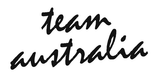
TEAM AUSTRALIA
CARLTON HOTEL & STUDIO
4 December – 20 December 2008
Jeremy Drape, Emily Ferretti, Veronica Kent, Annika Koops, Brendan Kee, Kiron Robinson, Natalie Ryan, Utako Shindo, Jackson Slattery, Salote Tawale, Glenn Walls.
Curated by Veronica Tello

Glenn Walls. Installation view. Painting of wall.

Glenn Walls. Prototype for Sophisticated Living 10, 11, 12 & 13 . Installation view.

Glenn Walls. Prototype for Sophisticated Living 10. Baseball bats, mirror tiles. Installation view.

Glenn Walls. Prototype for Sophisticated Living 11. Adidas skull caps sneakers, mirror tiles. Installation view.

Glenn Walls. Prototype for Sophisticated Living 12. Adidas ice skates, mirror tiles. Installation view.

Glenn Walls. Prototype for Sophisticated Living 10, 11, 12 & 13 . Installation view.

Glenn Walls. Prototype for Sophisticated Living 10, 11, 12 & 13 . Installation view.

In the past fifteen years, the Australian art industry has demonstrated a vigorous approach to immersing artists within the international networks of contemporary art. However, for the most part, there remains a feeling, or a concern, that we merely inhabit the margins of such networks. In such light, it is interesting to consider the aesthetics that shape or rupture our perception of Australian art and culture. This exhibition presents a part of the multitude of contemporary art practices and points of view in Australia.
Using strategies of response, appropriation, reenactment, or mimicry, the artists in team australia present a variety of interpretations to the concept of Australian art history. In the series Between a Rock (2008), Brendan Lee signals to a variety of iconic Australian symbols such as the gum-tree, a Chico roll at Cronulla beach, and cultural products such as Peter Weir’s Picnic at Hanging Rock (1975), Frederick McCubbin’s Lost (1886) and Bruce Beresford’s Puberty Blues (1981). Lee’s Between a Rock places at its centre the artist’s pre-occupation with notions of place and its history, especially as it is produced and reiterated by popular culture. As Lee’s work demonstrates, such re-presentations of iconic landscapes can paradoxically bring about a sense of dislocation, or antagonism, rather than an association or nostalgia, for what can and does ensue is a negotiation of clichés about Australia, perhaps such as those gratingly provoked by pop culture products such Baz Luhrman’s Australia (2008). In Natalie Ryan’s semi-precious (d.h skull) (2008), a lamb’s skull is used to appropriate the celebrity artist Damien Hirst and his diamond-encrusted human skull For the Love of God (2007). Ryan’s work mimics the presentation of Hirst’s art as intensified spectacle, as evidenced by its price tag of US$99 million and the amount of security surrounding the object, which as Hirst’s business manager has stated is “more synonymous with an international airport than an art gallery.” With economic restraints, Ryan mimics Hirst’s work and its presentation, transformed of course by the decaying environment of the Carlton. Ryan and other artists in this exhibition formulate an aesthetic that is thoroughly intertwined with a sense of internationalism, where the overwhelming influence of European and American art is emphasized. This sense of internationalism can come in the form of artist-in-residencies and their effect on artist’s practice, as demonstrated by Koops who undertook a residency in Rotterdam’s Foundation B.A.D during 2007-2008. Her work for this exhibition, Untitled (2008) is a continuation of her research in the Netherlands, particularly on Dutch Renaissance painting, and is also an excavation of art historical resonances in current visual culture. Koops states, “By means of comparative analysis, my work examines the ambiguity of gesture, expression, and contextual meaning…these images present altered and constructed states, which cross-fertilize and muddle meaning and status as well as the methodologies related to production and their perceived categories”. Within the context of this exhibition, it is also important to note the effect of artist-in-residencies on Australian contemporary artists, which has arguably given birth to a vigorous and focused approach to contemporary art discourse, and the possibility of interpolation within and outside Australia. This inside/outside dichotomy is also presented by Jackson Slattery and his small, detailed, and engrossing watercolour works. Slattery’s Mistakes We Wish We’d Made (2007-2008) is a series of false representations of Russia, which have been assembled from a variety of image sources derived from the photo-sharing site Flicker. As such, they are reflections of an outward-looking and perhaps omnipresent subject, who knows of the subject matter that he depicts through a series of assumptions. This outward-looking mode of being is also found in Emily Ferretti’s Punching Bag (2008) and Training Curls (2008). An image of the word ‘training’ is placed parallel to an image of a punching bag hanging on a gum tree. The artist describes the combination of this text and image as a reference to a working-class psyche of ‘training’ to better one’s economic situation and an obsessive form of discipline employed as a means to reach a higher plane. The artist, as a marginalised figure within Australian culture, is replaced by the allegory of the boxer.
In the work of Tawale and Walls, the work of the British artist Sarah Lucas and the Italian group Superstudio is appropriated respectively. Lucas’ autobiographic work suits Tawale’s own concern with her discomfort of the stereotypes that accompany the tags of identity – she is an ‘Australian-Islander lesbo artist’, a point that seems to be the relentless focus in the interpretation of her work. Tawale’s use of kitsch materiality (after Lucas) emphasises what she perceives to be an awkward stereotype relevant to her identity. Here, the ‘collaboration’ with Lucas, for the purpose of extracting an effective working methodology for Tawale’s artworks, is a case in point about the multiple influences on Australian artists. Likewise, in Walls’s work, the radical architect group Superstudio, which was founded in 1966 by Adolfo Natalini and Cristiano Toraldo di Francia, plays a significant role in informing Walls production of objects, which he dubbs Prototypes for Sophisticated Living. In 1969, Superstudio presented The Continuous Monument project, visually defined by a series of grids, which form the material and formal basis of Wall’s presentation of mini-architecture or mutated commodities, such as the Adidas shoe. Walls explains “the apparently endless framework of a mirror or black and white grid – which was to become the group’s [Superstudio] best-known motif – extends across the earth’s surface in a critique of what Superstudio saw as the absurdities of contemporary urban planning.” This absurdity and complex relationship to space is at the core of Walls own critical explorations of contemporary space and commodity culture. Veronica Kent’s work, Duck Traveller/Where Babies Come From (2008) is a development of her investigations into telepathy, bestiality, fainting, and haunting and is also, as the artists says, a development of her explorations into “the stories and aesthetics of Greek mythology, Christian parables and ‘new age’ imaginings (along with the wilder assertions of psychoanalytic theory and metaphysics).” Throughout these works, the influence of Euro-American art history and discourse is palpable.
Team Australia catalog essay written by Veronica Tello
Prototype for Sophisticated Living 5, 6, 7 & 8
RMIT/SIEMANS Post Graduate Awards Exhibition
RMIT GALLERY
December 2008

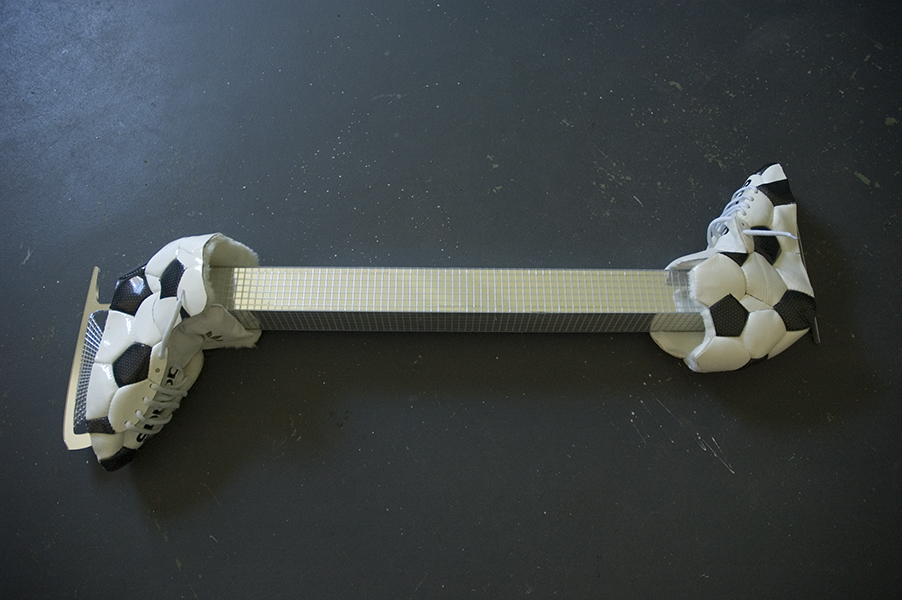
Glenn Walls. Prototype for Sophisticated Living 8. Addidas soccer ball. 2008

Glenn Walls. Prototype for Sophisticated Living 5, 6, 7 & 8. Addidas soccer ball. 2008

Glenn Walls. Prototype for Sophisticated Living 7 & 8. Baseball bat, mirror tiles, Addidas soccer ball. 2008
Prototype for Sophisticated Living 5, 6, 7 & 8 where also shown as part of Neo Pop held at John Buckley Gallery 3 December – 7 December, 2009.
Artist exhibiting: Howard Arkley, Rae Bolotin, Marcel Cousins, Janenne Eaton, Kate Just, Christopher Langton, Callum Morton, Scott Redford, Stuart Ringholt, Carl Scrase, David Wadelton, Glenn Walls.

Review of Neo Pop in The Age Newspaper, December 10, 2008, by Robert Nelson.
Going Home

Glenn Walls Ludwig Mies van der Rohe, Farnsworth House, 1945 – 51
Untitled (Going Home) is a series of digital prints photographed in the house I grew up in. Located in Melbourne the house had been in the family for almost fifty years. However growing up in this house, I dreamt of living in another world, a modernist world. This world consisted of clean lines, white walls and minimalist furniture that had no connection to past histories or memories.
In June 2006, the house was left vacant and up for sale. Realising the house would soon be out of my family possession, I went back to document my connection to the house, its history and more importantly my memories. For a few short weeks I had the opportunity to act out my childhood fantasy of connecting my family home to a particular form of modernism I only know through books and the Internet, however at the same time allowing the house to shine in its blandness as a place of memory.


Broke – Prototype for Sophisticated Living 1, 2, 3 & 4
BROKE
CARLTON HOTEL & STUDIO
21 January – 5 February, 2008
Andrew Atchison, Danielle Karalus, Marcus Keating, Pip Shea, Glenn Walls
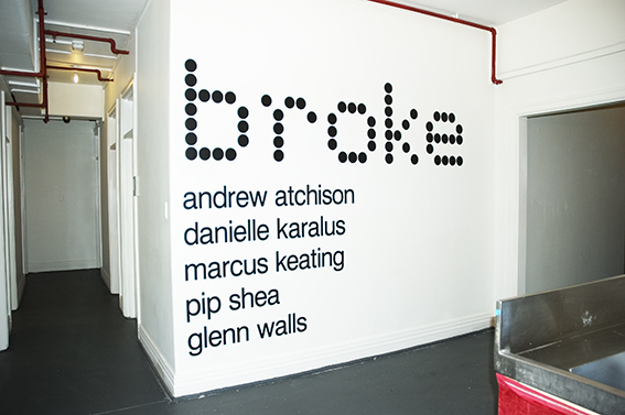


Prototype for Sophisticated Living 1 for the exhibition Broke At the Carlton Hotel & Studios 2008
Let’s talk about it, or new utopias
By
Rebecca Coates is an independent curator and writer, Adjunct Curator at Australian Centre for Contemporary Art (ACCA), and currently undertaking a PhD at the University of Melbourne looking at site-specific, ephemeral based installations.
Blubberland: The Dangers of Happiness , a new book by Elizabeth Farrelly, coins a new term for a new form of architectural horrible-ness. For Farrelly, Western society is now a “Blubberland”, a society in which ‘most of us have more than enough of what we need and more than enough of what we want as well’. As she continues, most of the inhabitants of Blubberland have far too much and more not only of material goods but also bodily fat, ‘to a degree that is dangerous for them and for the future of the planet.’ Thus the development of the McMansion: vast sprawling architectural monstrosities with too many bedrooms, an equal number of bathrooms, four-space garages, and so many windows that those commissioning them can’t afford the curtains. And filled they are to groaning point with all the stuff and possessions a family could not possibly want, let alone need.
The disillusionment and rejection of modernist architectural ideals by the 1960s Italian group Superstudio might be akin to a similar rejection of today’s faceless, tasteless, mass-consumist architecture in what was once the green belt. Once only the domain of savvy architects and design aficionados, Superstudio’s little-known architectural vision is undergoing a cult revival as architects and artists look to articulate their dissatisfaction with popular trends and developments.
Founded in Florence by a group of radical young architects in 1966, Superstudio laid out their vision of a built environment, ‘an efficient minimalist space that provides an ordered existence .. [The space should] not [be] constructed on the whims of consumerism and fashion.’ The location of this new form of avant-garde thinking is of course not accidental: Florence, Italy: a town ‘where all such contradictions become evident … [a town which] stands historically symbolic.’ And what better vehicle to launch their manifesto than Italian Vogue: anarchy and avant-garde are nothing if not fashionable.
To read the full transcript click on the Articles icon on the right hand side.
Room 1
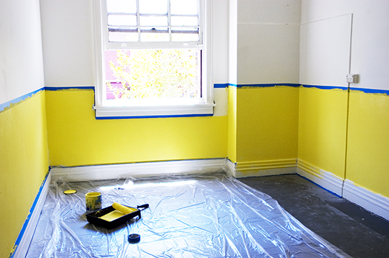
Room 1: Preparing the gallery space.

Room 1: Preparing the gallery space.
Room 1: Preparing the gallery space.
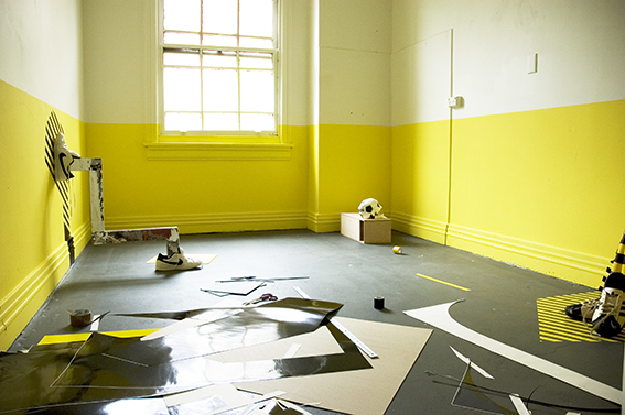
Room 1: Preparing the gallery space.
Room 1: Preparing the gallery space.
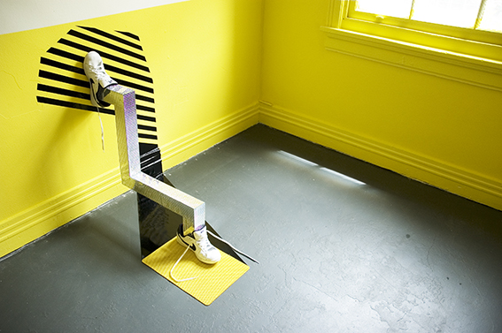
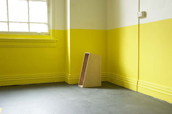
Room 1: Prototype for Sophisticated Living No 2. Mirror tiles, Nike SB shoes, self-adhesive vinyl, plastic mat.

Room 1: Prototype for Sophisticated Living No 2. Mirror tiles, Nike SB shoes, self-adhesive vinyl, plastic mat.

Room 1: Prototype for Sophisticated Living No 3. Adidas soccer ball, wood, fake fur, self-adhesive vinyl.
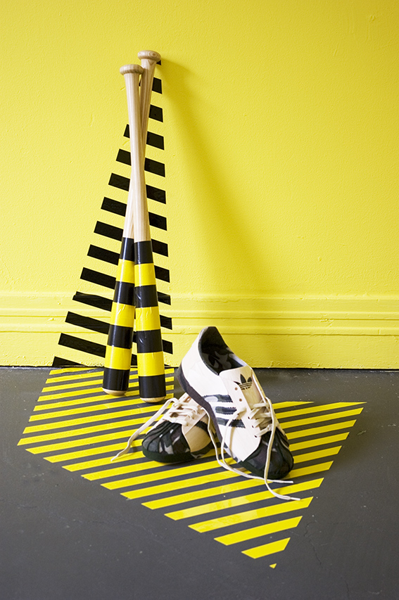
Room 1: Prototype for Sophisticated Living No 4. Adidas Skull Cap sneakers hand made from Balsa wood, felt, Baseball bats, self-adhesive vinyl, skateboard deck.
Room 1: Prototype for Sophisticated Living No 2. Mirror tiles, Nike SB shoes, self-adhesive vinyl, plastic mat.
Room 1: Prototype for Sophisticated Living No 4. Adidas Skull Cap sneakers hand made from Balsa wood, felt, Baseball bats, self-adhesive vinyl, skateboard deck.

Room 1: Installation view.

Room 1: Prototype for Sophisticated Living No 3. Adidas soccer ball, wood, fake fur, self-adhesive vinyl.

Room 1: Prototype for Sophisticated Living No 4. Skateboard deck.
Room 1: Prototype for Sophisticated Living No 4. Adidas Skull Cap sneakers hand made from Balsa wood, felt, Baseball bats, self-adhesive vinyl, skateboard deck.

Room 1: Prototype for Sophisticated Living No 2. Mirror tiles, Nike SB shoes, self-adhesive vinyl, plastic mat.
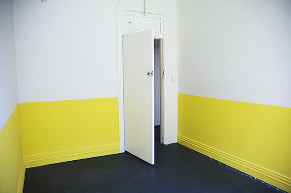
Room 2

Room 2: Prototype for Sophisticated Living No 1. Mirror tiles, Skateboard wheels, mirror perspex.

Room 2: Prototype for Sophisticated Living No 1. Mirror tiles, skateboard wheels, mirror perspex
How to avoid Modernism
HOW TO AVOID MODERNISM
GERTRUDE CONTEMPORARY ART SPACES
April, 2008.


In 2005 l created a scale model of Philip Johnson’s Glass House (1949). As with Farnsworth House I was attracted to Johnson’s simple lines, geometrical forms and large floor-to-ceiling windows that opened up the interior to the outside world. It was not until 2008 that the thought of using the model for the work How to avoid modernism (2008) came to fruition and was exhibited at Gertrude Contemporary Art Spaces in April 2008 (slide).

Philip Johnson, Glass House, 1949

Text Me
TEXT ME
SPACEMENT
17 August – 2 September, 2006.
Artists: Gabrielle De Vietri, Danielle Freakley, Sanne Mestrom, Rose Nolan, Pandarosa, Glenn Walls.
Curated by Glenn Walls.

Text Me at Spacement

Text Me at Spacement
Text Me at Spacement
Text Me
Spacement, Melbourne
August 17th to September 2nd 2006
By Christine Morrow. Curator, Museum of Contemporary Art, Sydney
Published in Eyeline Number 61: Spring 2006
Text Me presented artworks on the theme of messaging. Curator, Glenn Walls, assembled a group that included him, four artists who regularly work with text – Rose Nolan, Sanné Mestrom, Gabrielle de Vietri and Danielle Freakley – together with the design duo Pandarosa.
The works incorporated the motif of text, or oblique references to it, across various technologies of expression not restricted to the typographic form. Although the artists showed an awareness of the history of concrete poetry, conceptual art and particularly the Art & Language movement, they avoided rehashing any of the old concerns of structural linguistics about the systematic features inherent in language’s operation.
The exhibition did not focus on the structures of language per se but its instrumentality in building relationships or communities. By foregrounding the social functions of language and privileging individual utterances, the exhibition closely examined various intimacies created by speech and writing. Certain of the artists achieved this by inserting themselves into the work, or by using first-person to second-person speech, as if to whisper to the viewer, this is about you and me. Others created this intimacy by expressing personal vulnerability. These various strategies seemed to run the spectrum bounded by the two extremes of what the imperative Text me can signify: on the one hand a breezy sign off meaning let’s talk and on the other a neediness of the you never write, you never call…variety.
Sanné Mestrom has become known for large-scale painted wall texts of quasi biblical messages rendered with dizzying spatial illusions. By contrast, in Text Me she presented a series of large black and white images that were so degraded they appeared to be copies of copies. They depicted a performance by the artist that involved smearing her painted body along a wall. There was no typographic text in this work; instead Mestrom presented the evidence of using her body as a writing instrument to create what could be seen to function like a kind of graffiti tag, based on the body leaving behind its own indexical signature on the wall. However, the immediacy of effect it sought to create was undone by presenting the documentation of the work rather than either performing the work or exhibiting the smeared wall.
Pandarosa presented a wall-painting framed by two freestanding cardboard forms painted with ink drawings of each of the two members of the collective. The painted wall featured their signature style of silhouette shapes overlaid with organic-looking spidery drawing. It appeared to spell out Pandarosa. It too functioned as a graffiti tag, but in a more literal way than did Mestrom’s work. The work’s main content was a representation of its own authors who signed it thrice over: once by creating it in their signature style, a second time by writing their name large within it and a third time by presenting images of each of the two of them framing the work like bookends. As we might expect from graphic designers, there was an overt concern with the way text’s typographical features mediate its signification. But in this instance, the duo achieved a kind of anti-typography for there as a partial breakdown of legibility in the individual letters and their sequencing.
Glenn Walls presented an installation that featured a crumbling wall supporting a puzzling assortment of images. These functioned like conceptual clues needing interpretation. This work was also a kind of graffiti tag, or signature writ large, but a very subtle one. By exhibiting a wall, the artist invoked his own surname, Walls, in the form of a rebus. The wall was papered with a repeated pattern of symbols reminiscent of a personal coat-of-arms based on an assortment of mementi mori: including a modernist building, a retro car, three skulls and an urn. An image of the artist appeared separately in each of the framed photographs displayed on the wall, but in them he was not really himself. Instead he functioned as a kind of blank person on which to hang messages and monograms. The entire effect was to generate a slippage between logos, the plural of logo (or logotype), and logos, the word. This wall appeared to simultaneously break down and reconstitute itself; through its self-referential play, it absorbed the signature, transformed and diffused it……….
Christine Morrow
To read the full transcript click on the Articles icon on the right hand side.
Men
MEN
WESTSPACE
Glenn Walls, Edward McMillan, Richard Block
27 May – 11 June, 2005
Gallery 3
John & Steve Construct is a collaborative project between artists, actors, DJs and multi media practitioners. Co-coordinator by Glen Walls this collective have a mutual interest in architecture and the critical analysis of space and how we use and act in it.
The exhibition Men will link the architecture of International Style to the personal lives of its inhabitants. It will result in a installation of artwork, which will present International Style architecture as a metaphor for the display of certain human behavior contradictory to the architecture’s concept of clean, sophisticated living.
Men exhibited at Westspace Inc
https://westspace.org.au/exhi/6390/men
Men exhibited at Westspace Inc
Men exhibited at Westspace Inc
Men exhibited at Westspace Inc

Men exhibited at Westspace Inc


leave a comment