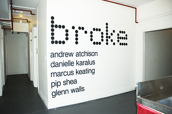
Broke – Prototype for Sophisticated Living 1, 2, 3 & 4
BROKE
CARLTON HOTEL & STUDIO
21 January – 5 February, 2008
Andrew Atchison, Danielle Karalus, Marcus Keating, Pip Shea, Glenn Walls


Prototype for Sophisticated Living 1 for the exhibition Broke At the Carlton Hotel & Studios 2008
Let’s talk about it, or new utopias
By
Rebecca Coates is an independent curator and writer, Adjunct Curator at Australian Centre for Contemporary Art (ACCA), and currently undertaking a PhD at the University of Melbourne looking at site-specific, ephemeral based installations.
Blubberland: The Dangers of Happiness , a new book by Elizabeth Farrelly, coins a new term for a new form of architectural horrible-ness. For Farrelly, Western society is now a “Blubberland”, a society in which ‘most of us have more than enough of what we need and more than enough of what we want as well’. As she continues, most of the inhabitants of Blubberland have far too much and more not only of material goods but also bodily fat, ‘to a degree that is dangerous for them and for the future of the planet.’ Thus the development of the McMansion: vast sprawling architectural monstrosities with too many bedrooms, an equal number of bathrooms, four-space garages, and so many windows that those commissioning them can’t afford the curtains. And filled they are to groaning point with all the stuff and possessions a family could not possibly want, let alone need.
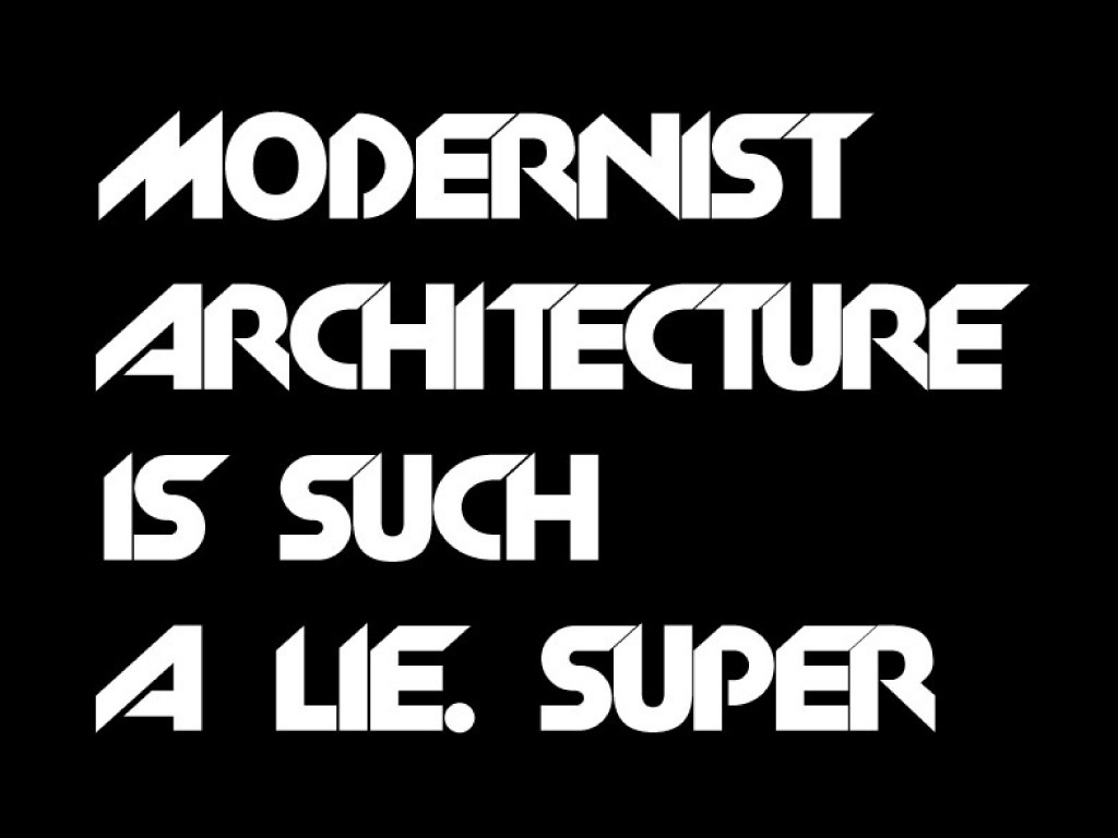
The disillusionment and rejection of modernist architectural ideals by the 1960s Italian group Superstudio might be akin to a similar rejection of today’s faceless, tasteless, mass-consumist architecture in what was once the green belt. Once only the domain of savvy architects and design aficionados, Superstudio’s little-known architectural vision is undergoing a cult revival as architects and artists look to articulate their dissatisfaction with popular trends and developments.
Founded in Florence by a group of radical young architects in 1966, Superstudio laid out their vision of a built environment, ‘an efficient minimalist space that provides an ordered existence .. [The space should] not [be] constructed on the whims of consumerism and fashion.’ The location of this new form of avant-garde thinking is of course not accidental: Florence, Italy: a town ‘where all such contradictions become evident … [a town which] stands historically symbolic.’ And what better vehicle to launch their manifesto than Italian Vogue: anarchy and avant-garde are nothing if not fashionable.
To read the full transcript click on the Articles icon on the right hand side.
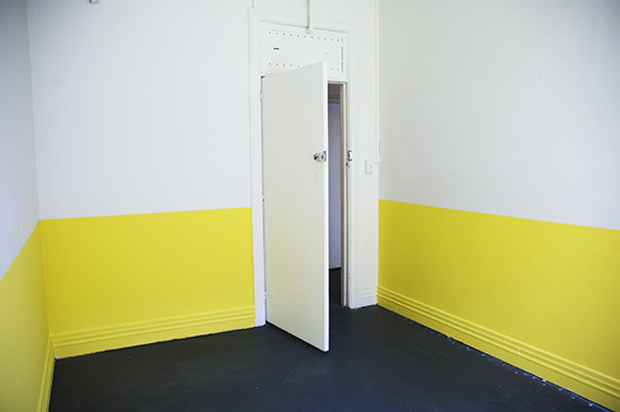
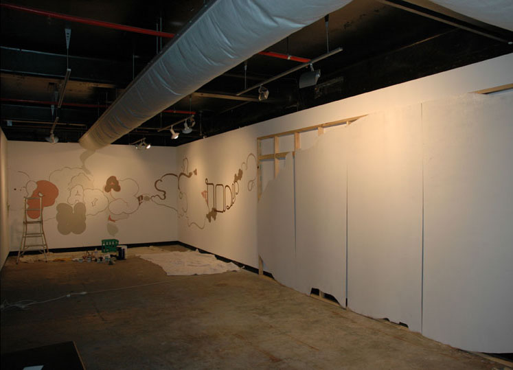
Room 1
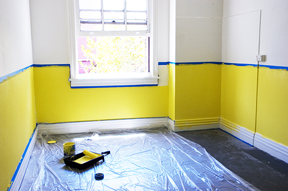
Room 1: Preparing the gallery space.

Room 1: Preparing the gallery space.
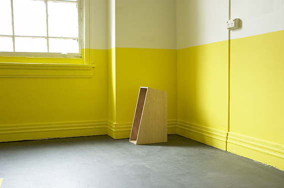
Room 1: Preparing the gallery space.
Room 1: Preparing the gallery space.
Room 1: Preparing the gallery space.
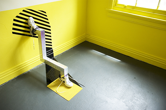
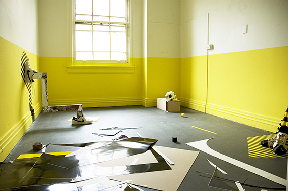
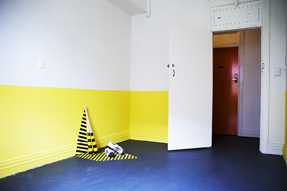
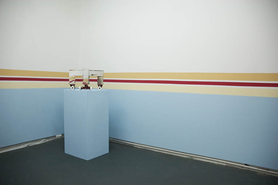
Room 1: Prototype for Sophisticated Living No 2. Mirror tiles, Nike SB shoes, self-adhesive vinyl, plastic mat.

Room 1: Prototype for Sophisticated Living No 2. Mirror tiles, Nike SB shoes, self-adhesive vinyl, plastic mat.

Room 1: Prototype for Sophisticated Living No 3. Adidas soccer ball, wood, fake fur, self-adhesive vinyl.
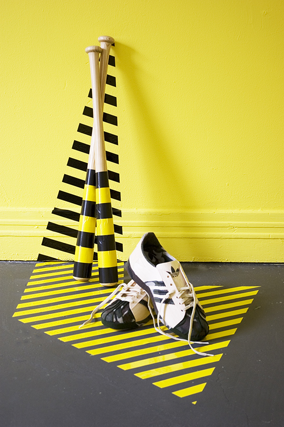
Room 1: Prototype for Sophisticated Living No 4. Adidas Skull Cap sneakers hand made from Balsa wood, felt, Baseball bats, self-adhesive vinyl, skateboard deck.
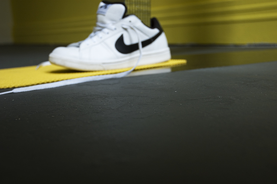
Room 1: Prototype for Sophisticated Living No 2. Mirror tiles, Nike SB shoes, self-adhesive vinyl, plastic mat.
Room 1: Prototype for Sophisticated Living No 4. Adidas Skull Cap sneakers hand made from Balsa wood, felt, Baseball bats, self-adhesive vinyl, skateboard deck.

Room 1: Installation view.

Room 1: Prototype for Sophisticated Living No 3. Adidas soccer ball, wood, fake fur, self-adhesive vinyl.

Room 1: Prototype for Sophisticated Living No 4. Skateboard deck.
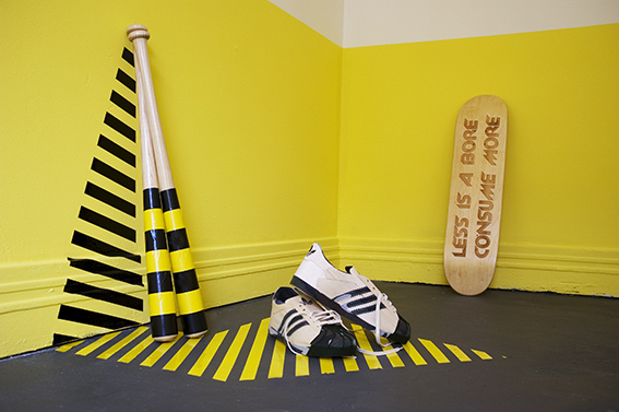
Room 1: Prototype for Sophisticated Living No 4. Adidas Skull Cap sneakers hand made from Balsa wood, felt, Baseball bats, self-adhesive vinyl, skateboard deck.

Room 1: Prototype for Sophisticated Living No 2. Mirror tiles, Nike SB shoes, self-adhesive vinyl, plastic mat.
Room 2

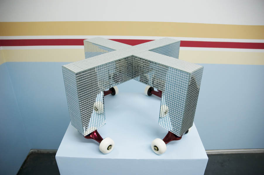
Room 2: Prototype for Sophisticated Living No 1. Mirror tiles, Skateboard wheels, mirror perspex.

Room 2: Prototype for Sophisticated Living No 1. Mirror tiles, skateboard wheels, mirror perspex
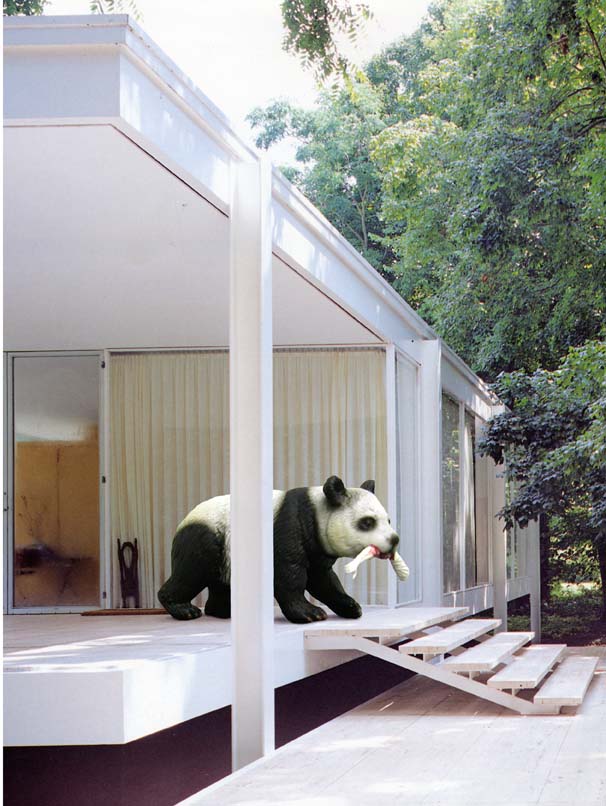
How to avoid Modernism
HOW TO AVOID MODERNISM
GERTRUDE CONTEMPORARY ART SPACES
April, 2008.


In 2005 l created a scale model of Philip Johnson’s Glass House (1949). As with Farnsworth House I was attracted to Johnson’s simple lines, geometrical forms and large floor-to-ceiling windows that opened up the interior to the outside world. It was not until 2008 that the thought of using the model for the work How to avoid modernism (2008) came to fruition and was exhibited at Gertrude Contemporary Art Spaces in April 2008 (slide).

Philip Johnson, Glass House, 1949

Text Me
TEXT ME
SPACEMENT
17 August – 2 September, 2006.
Artists: Gabrielle De Vietri, Danielle Freakley, Sanne Mestrom, Rose Nolan, Pandarosa, Glenn Walls.
Curated by Glenn Walls.

Text Me at Spacement

Text Me at Spacement
Text Me at Spacement
Text Me
Spacement, Melbourne
August 17th to September 2nd 2006
By Christine Morrow. Curator, Museum of Contemporary Art, Sydney
Published in Eyeline Number 61: Spring 2006
Text Me presented artworks on the theme of messaging. Curator, Glenn Walls, assembled a group that included him, four artists who regularly work with text – Rose Nolan, Sanné Mestrom, Gabrielle de Vietri and Danielle Freakley – together with the design duo Pandarosa.
The works incorporated the motif of text, or oblique references to it, across various technologies of expression not restricted to the typographic form. Although the artists showed an awareness of the history of concrete poetry, conceptual art and particularly the Art & Language movement, they avoided rehashing any of the old concerns of structural linguistics about the systematic features inherent in language’s operation.
The exhibition did not focus on the structures of language per se but its instrumentality in building relationships or communities. By foregrounding the social functions of language and privileging individual utterances, the exhibition closely examined various intimacies created by speech and writing. Certain of the artists achieved this by inserting themselves into the work, or by using first-person to second-person speech, as if to whisper to the viewer, this is about you and me. Others created this intimacy by expressing personal vulnerability. These various strategies seemed to run the spectrum bounded by the two extremes of what the imperative Text me can signify: on the one hand a breezy sign off meaning let’s talk and on the other a neediness of the you never write, you never call…variety.
Sanné Mestrom has become known for large-scale painted wall texts of quasi biblical messages rendered with dizzying spatial illusions. By contrast, in Text Me she presented a series of large black and white images that were so degraded they appeared to be copies of copies. They depicted a performance by the artist that involved smearing her painted body along a wall. There was no typographic text in this work; instead Mestrom presented the evidence of using her body as a writing instrument to create what could be seen to function like a kind of graffiti tag, based on the body leaving behind its own indexical signature on the wall. However, the immediacy of effect it sought to create was undone by presenting the documentation of the work rather than either performing the work or exhibiting the smeared wall.
Pandarosa presented a wall-painting framed by two freestanding cardboard forms painted with ink drawings of each of the two members of the collective. The painted wall featured their signature style of silhouette shapes overlaid with organic-looking spidery drawing. It appeared to spell out Pandarosa. It too functioned as a graffiti tag, but in a more literal way than did Mestrom’s work. The work’s main content was a representation of its own authors who signed it thrice over: once by creating it in their signature style, a second time by writing their name large within it and a third time by presenting images of each of the two of them framing the work like bookends. As we might expect from graphic designers, there was an overt concern with the way text’s typographical features mediate its signification. But in this instance, the duo achieved a kind of anti-typography for there as a partial breakdown of legibility in the individual letters and their sequencing.
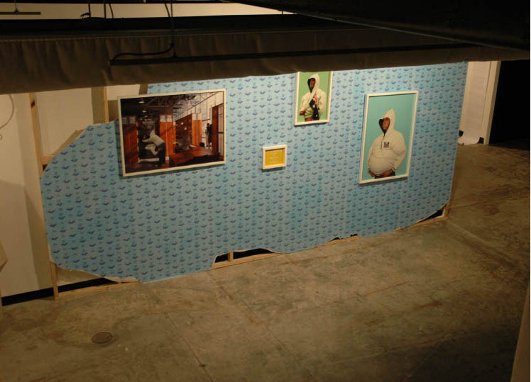
Glenn Walls presented an installation that featured a crumbling wall supporting a puzzling assortment of images. These functioned like conceptual clues needing interpretation. This work was also a kind of graffiti tag, or signature writ large, but a very subtle one. By exhibiting a wall, the artist invoked his own surname, Walls, in the form of a rebus. The wall was papered with a repeated pattern of symbols reminiscent of a personal coat-of-arms based on an assortment of mementi mori: including a modernist building, a retro car, three skulls and an urn. An image of the artist appeared separately in each of the framed photographs displayed on the wall, but in them he was not really himself. Instead he functioned as a kind of blank person on which to hang messages and monograms. The entire effect was to generate a slippage between logos, the plural of logo (or logotype), and logos, the word. This wall appeared to simultaneously break down and reconstitute itself; through its self-referential play, it absorbed the signature, transformed and diffused it……….
Christine Morrow
To read the full transcript click on the Articles icon on the right hand side.
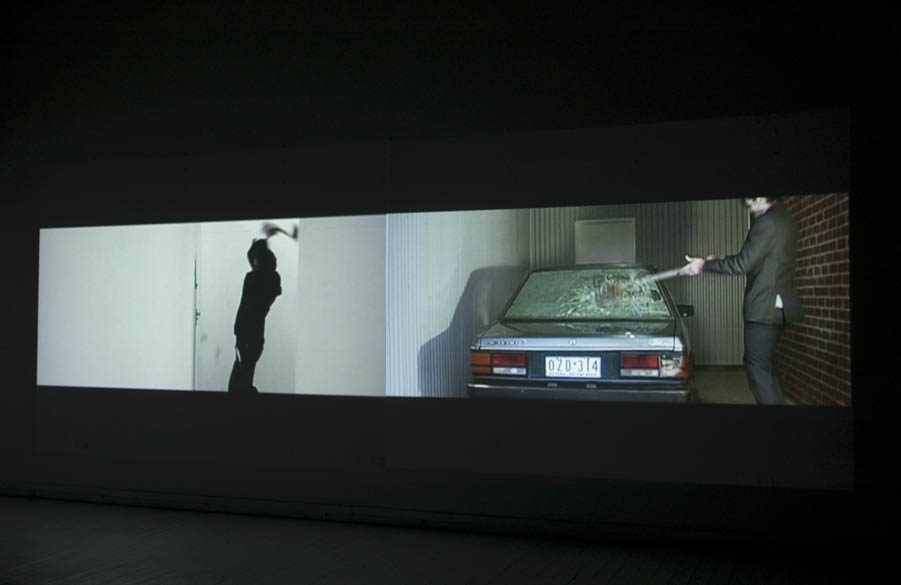
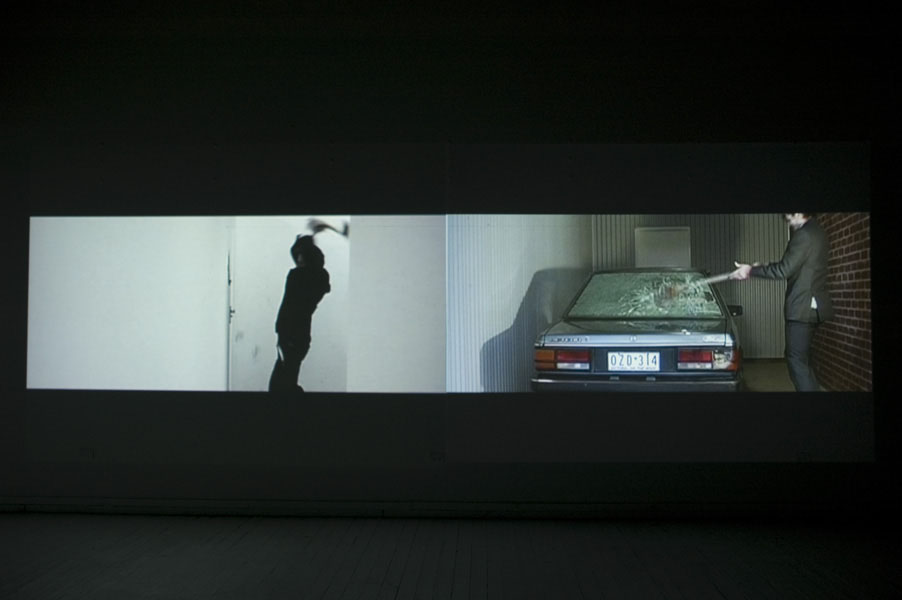
Men
MEN
WESTSPACE
Glenn Walls, Edward McMillan, Richard Block
27 May – 11 June, 2005
Gallery 3
John & Steve Construct is a collaborative project between artists, actors, DJs and multi media practitioners. Co-coordinator by Glen Walls this collective have a mutual interest in architecture and the critical analysis of space and how we use and act in it.
The exhibition Men will link the architecture of International Style to the personal lives of its inhabitants. It will result in a installation of artwork, which will present International Style architecture as a metaphor for the display of certain human behavior contradictory to the architecture’s concept of clean, sophisticated living.
Men exhibited at Westspace Inc
https://westspace.org.au/exhi/6390/men
Men exhibited at Westspace Inc
Men exhibited at Westspace Inc
Men exhibited at Westspace Inc

Men exhibited at Westspace Inc


leave a comment